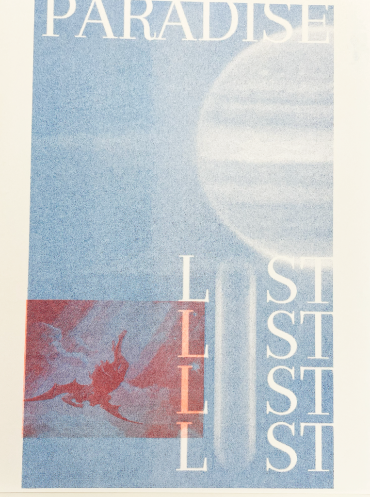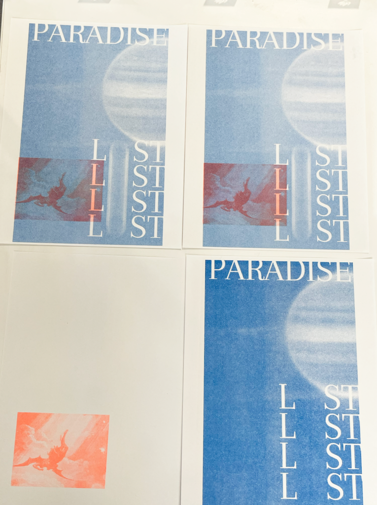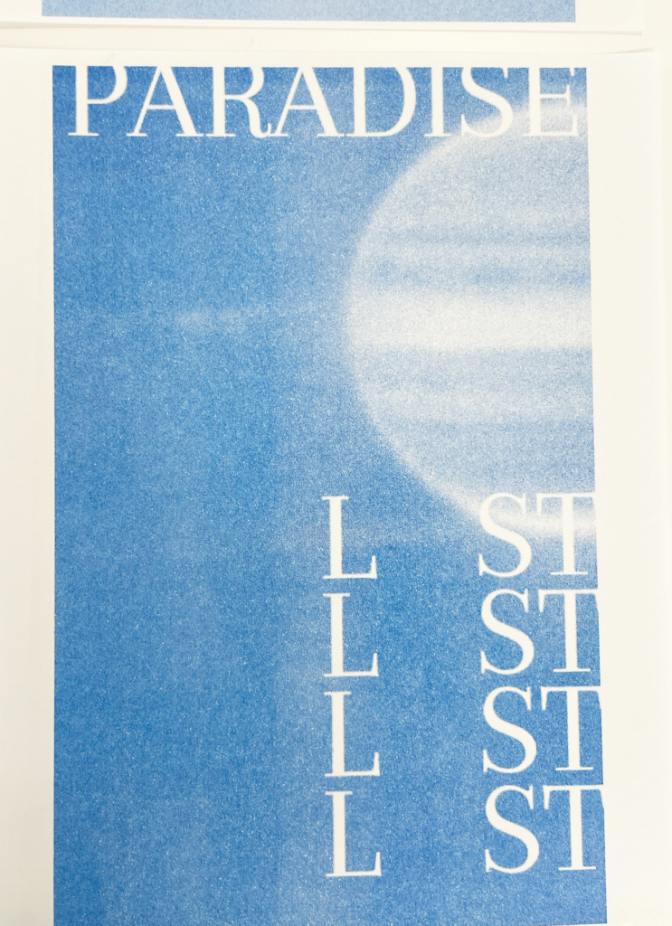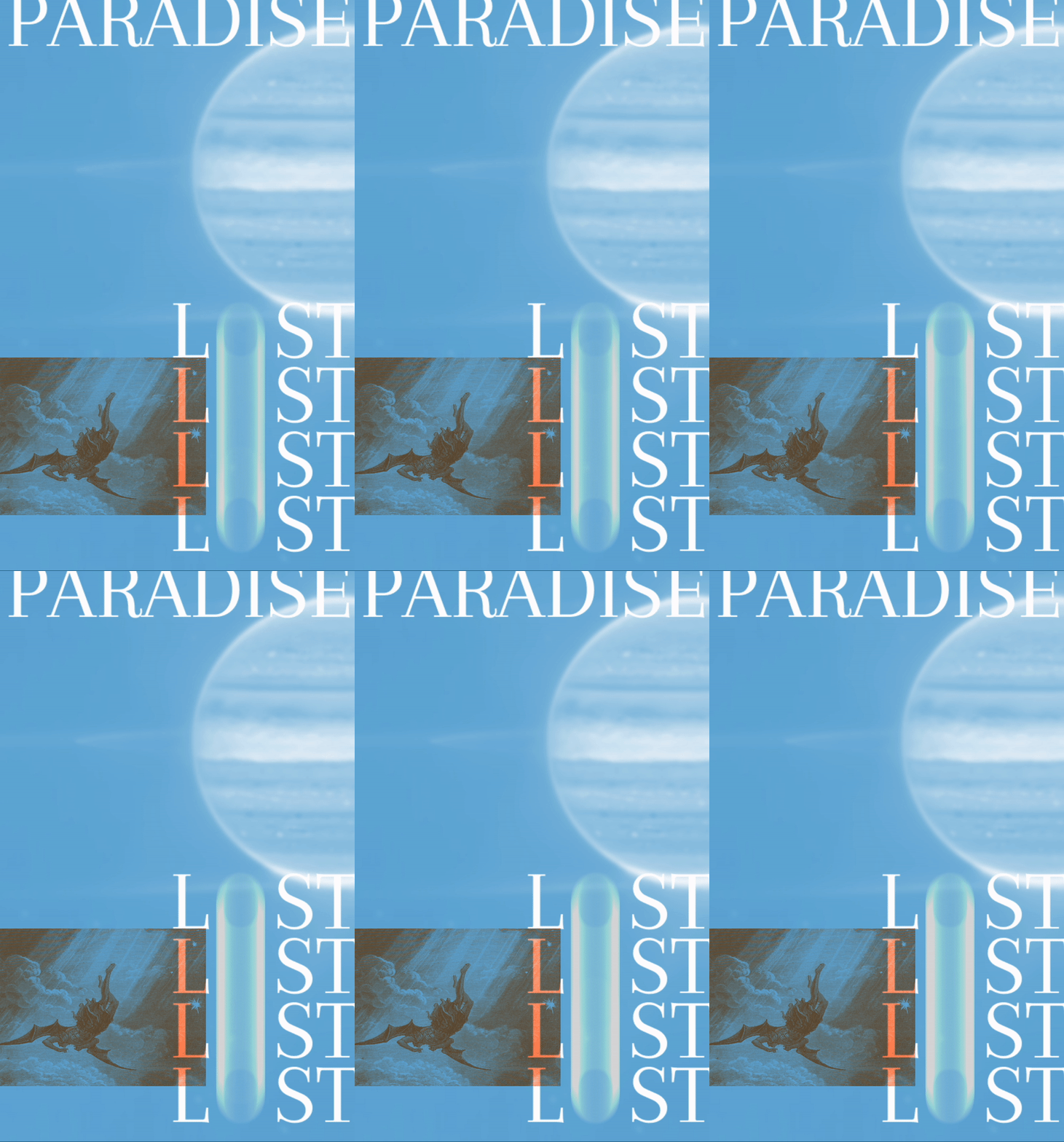
For the first assignment I decided to create a simple sketch on p5.js which two images that I layered to be printed in different colors and also added an animated factor as well. For the ‘O’ of the cascading text I wanted there to be movement and opacity that would be in motion once captured and printed. I was curious to see what an object in motion would look like when riso printed.

I chose to print in blue and neon orange but I found that with the almost full color background layered with the neon orange image looked a bit muddier than I had expected. I also found that the movement of the typography was less apparent once printed than when seen on screen but was happy that at least the object seemed to be in motion.


Overall, I think that this exercise was really helpful in getting a grasp of how images and colors print when printed on the riso printer and how to manage colors a bit better for this situation.