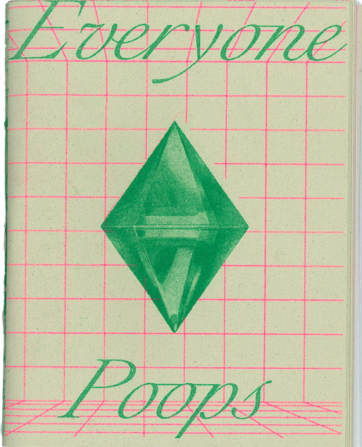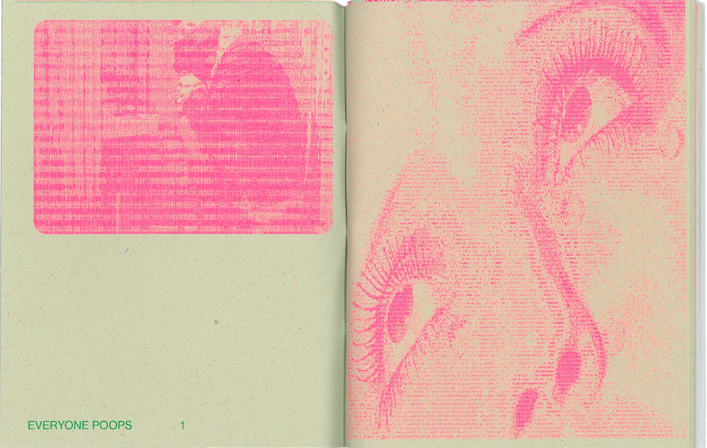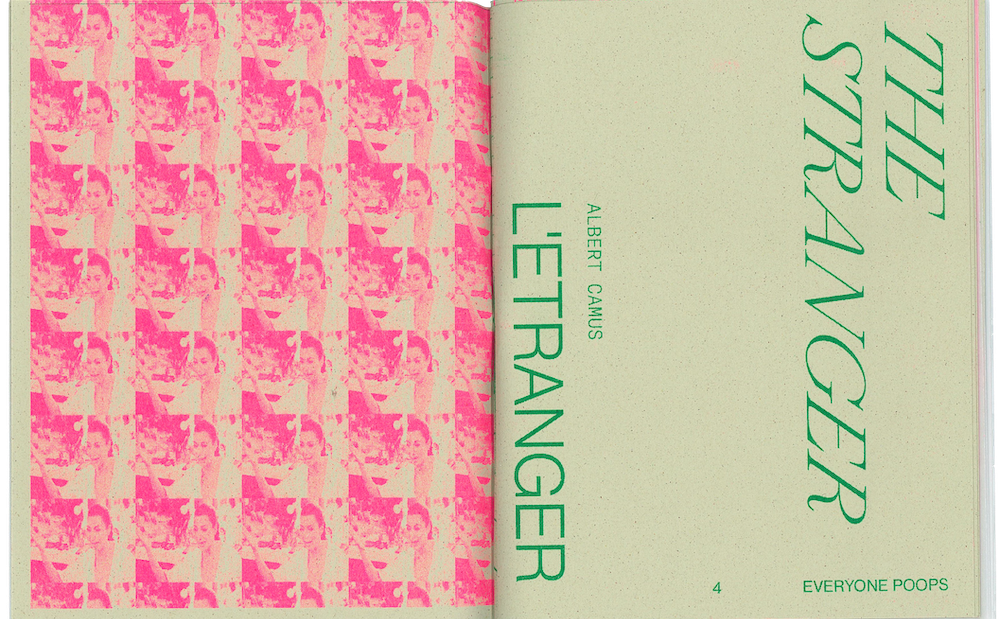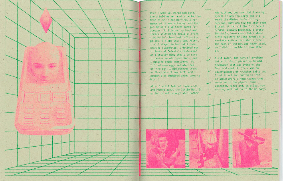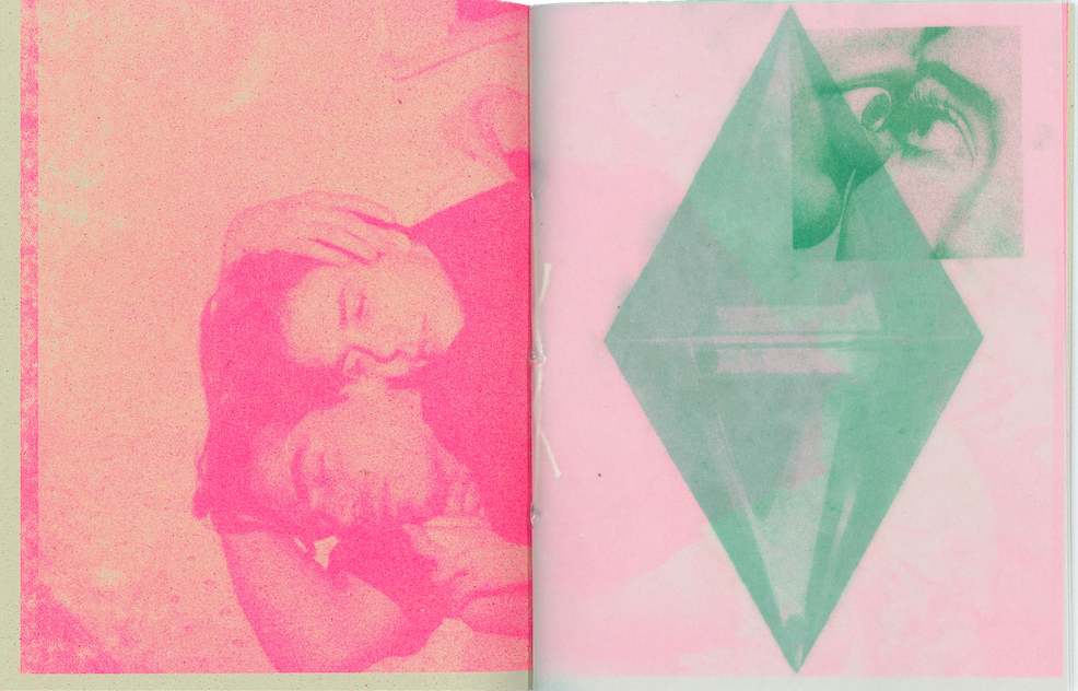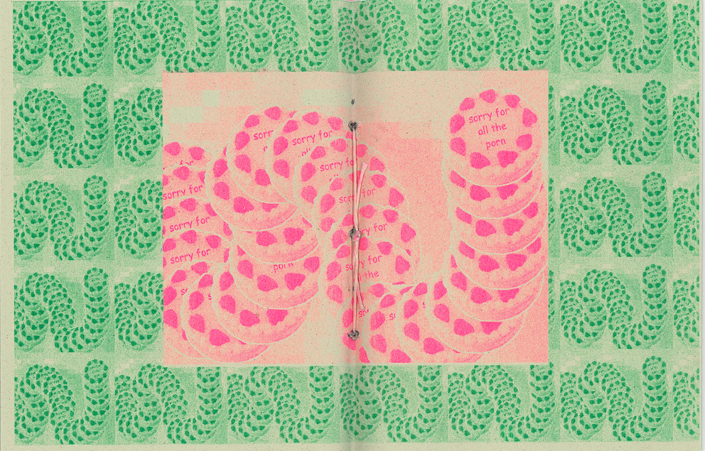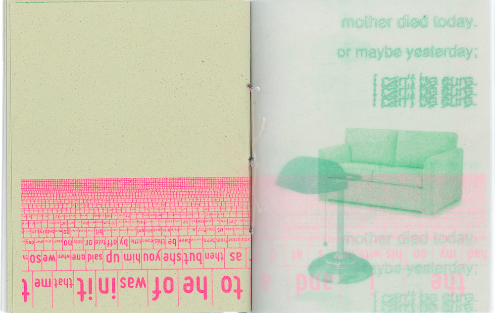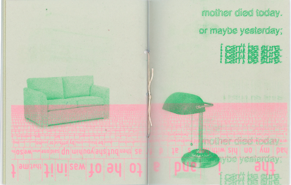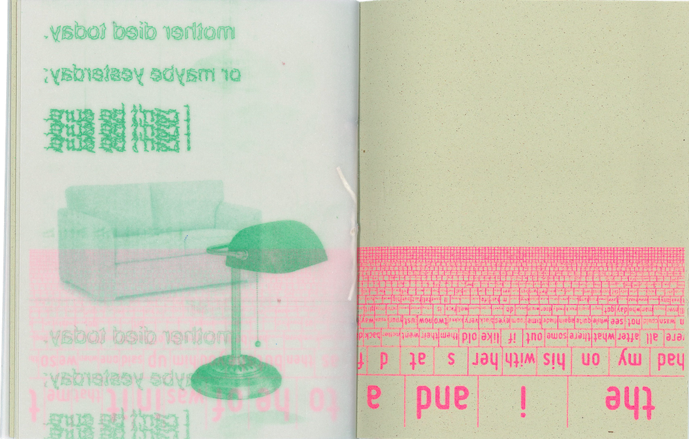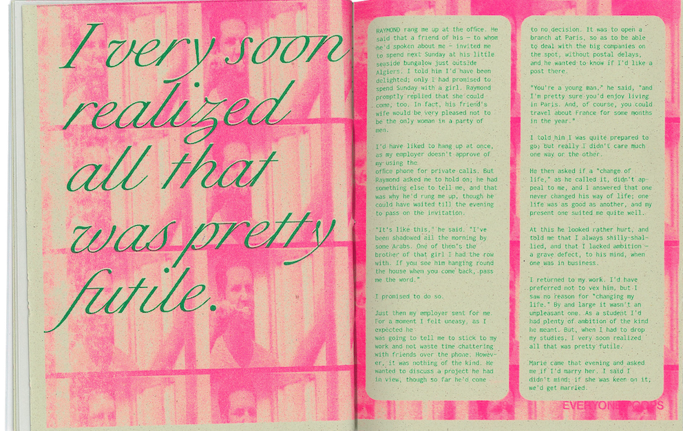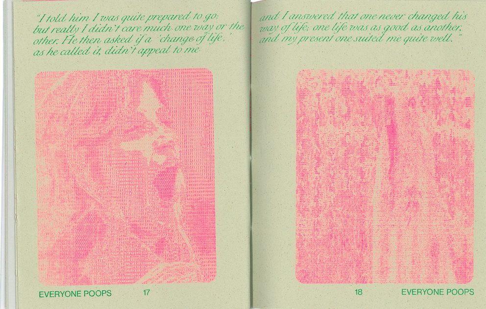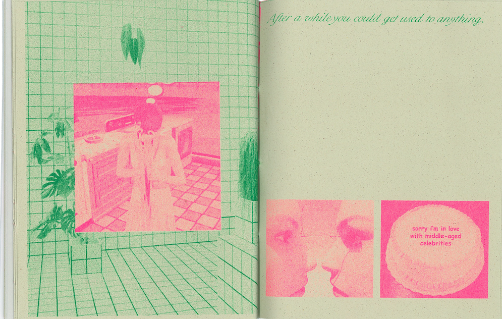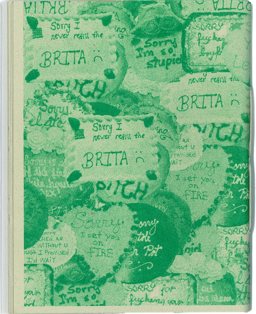
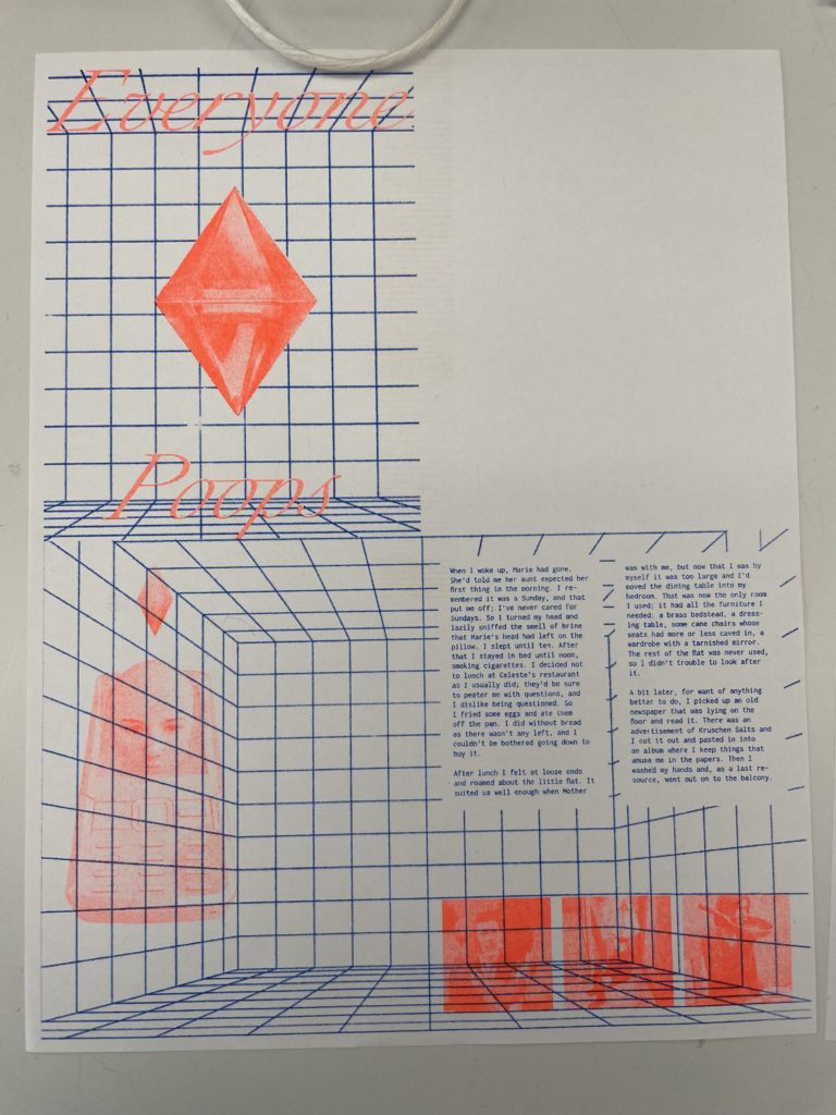
Everyone Poops is an experimental publication that explores public/private human behavior as well as questions of real and fake. We couple excerpts from The Stranger by Albert Camus with an assortment of still images that range from pop culture references to glitches in the Sims. We also implement elements of generative design in the grids and typography layouts on some pages.
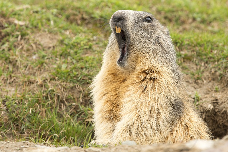
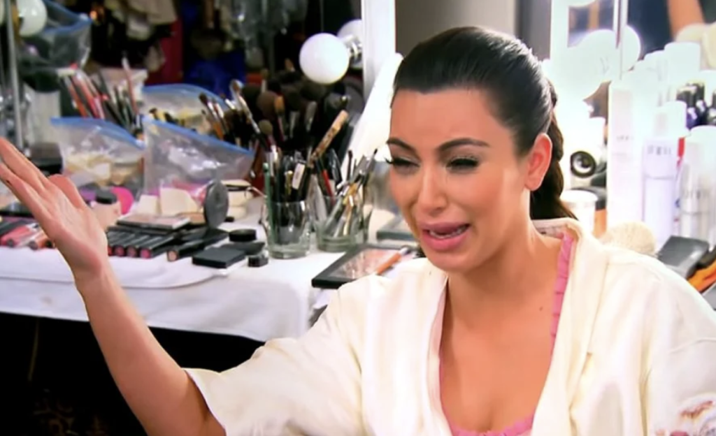
From the beginning, we set out to create a collection with an absurdist/uncanny, or even gross tone. What stemmed from a collection of photos of people burping / yelling / crying / brushing their teeth morphed and evolved as we iterated on our designs before we ended on our final product.
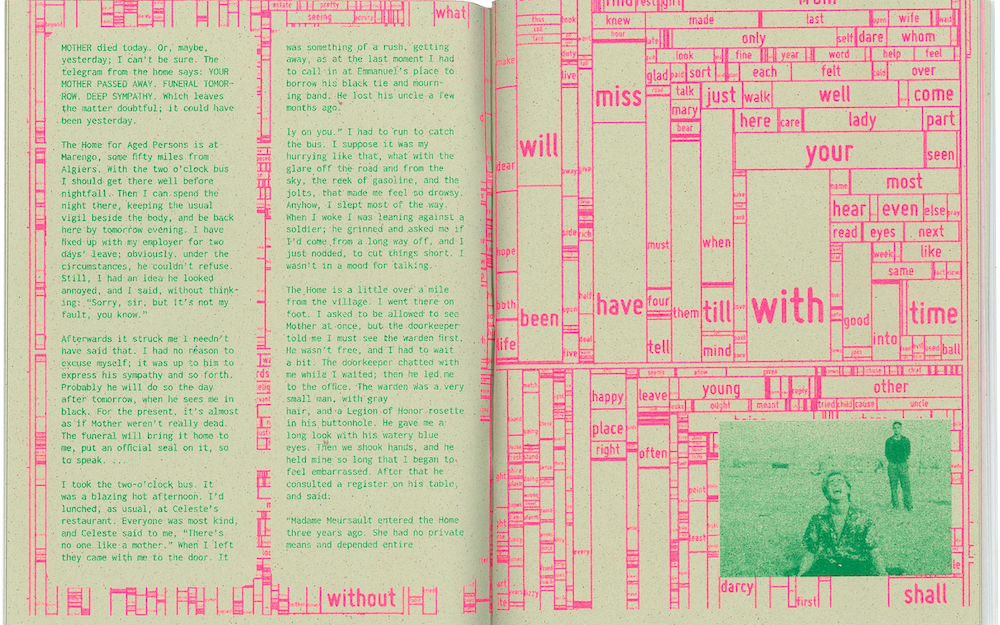
Generative Text
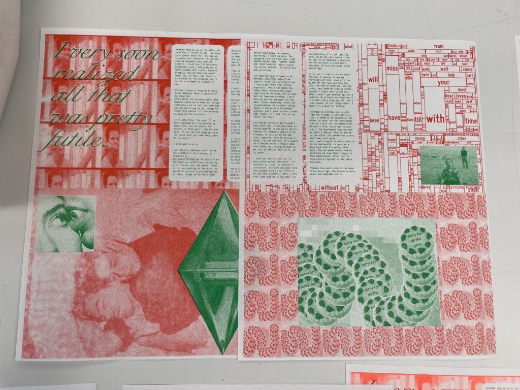
The text in our zine is all excerpts from Albert Camus’s The Stranger, an influential novel on the meaninglessness of life. To create the generative text designs, we found a .txt file of the novel online and ran it through some existing generative text codes from this Generative Design book. These codes use rita.js to sift through the .txt file, and the size of the word correlates to the frequency it appears in the file.
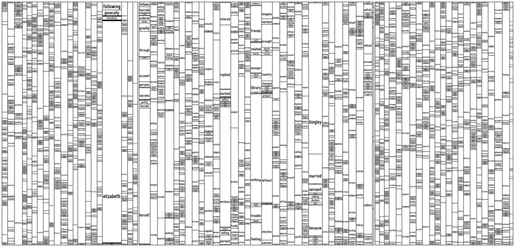
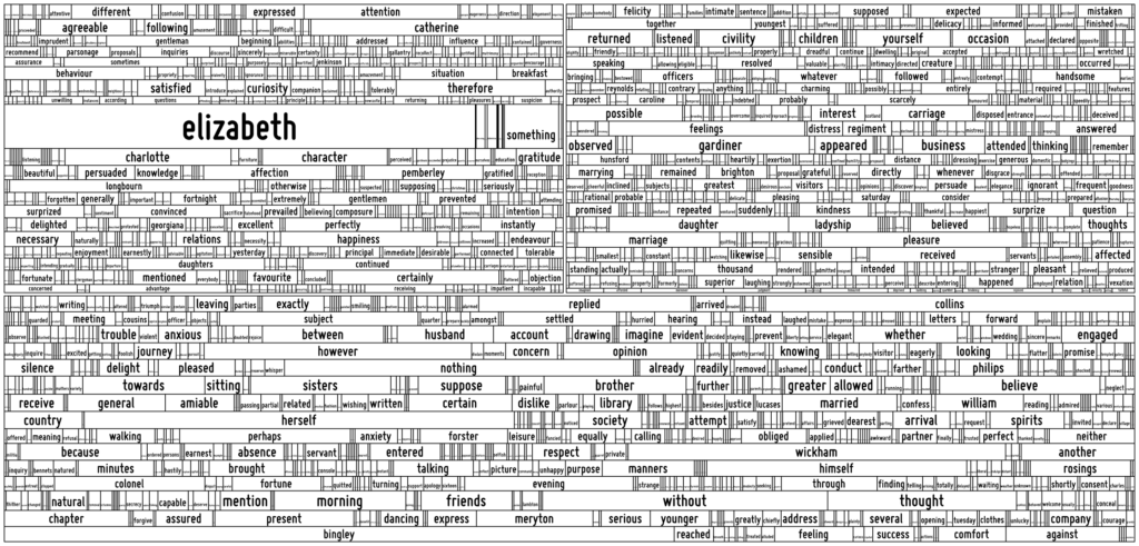
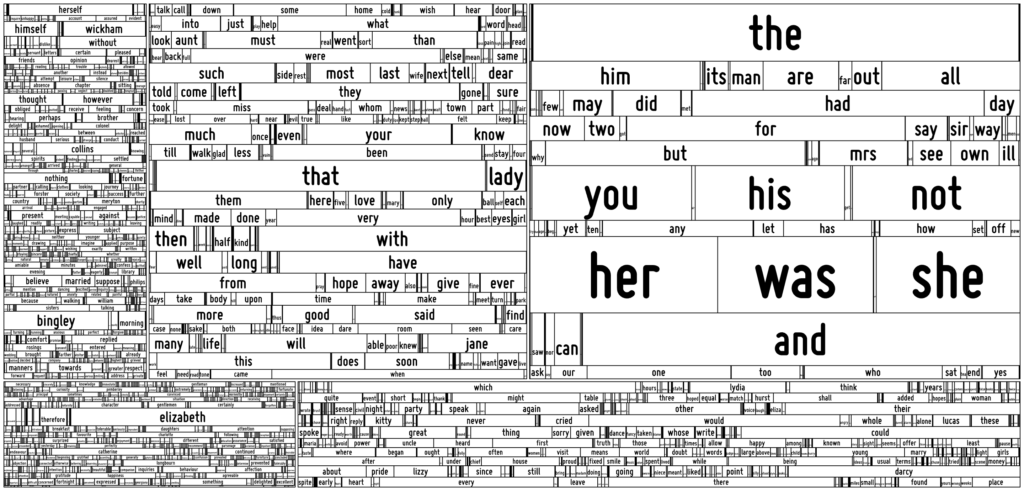
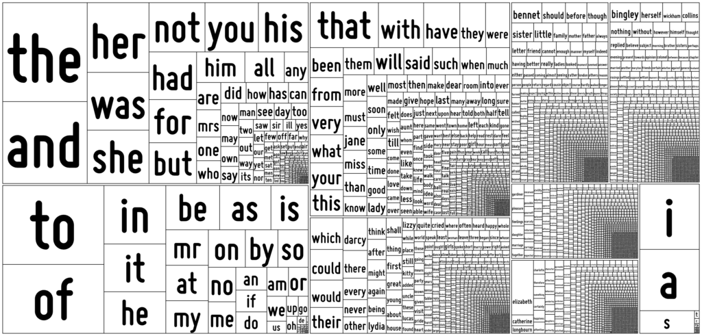
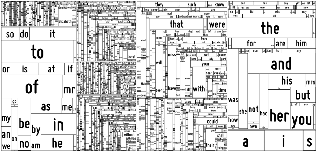
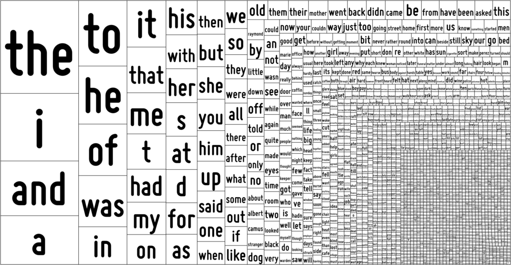
Image Collection
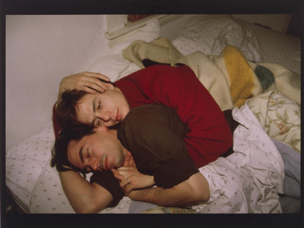
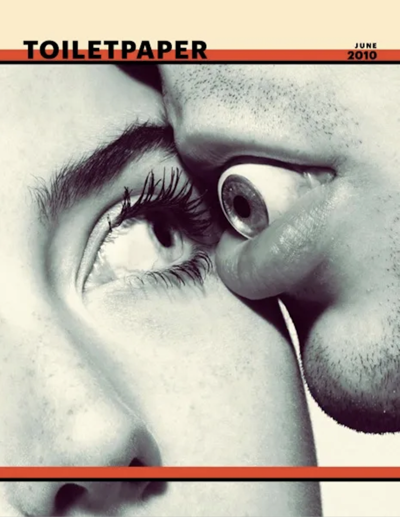
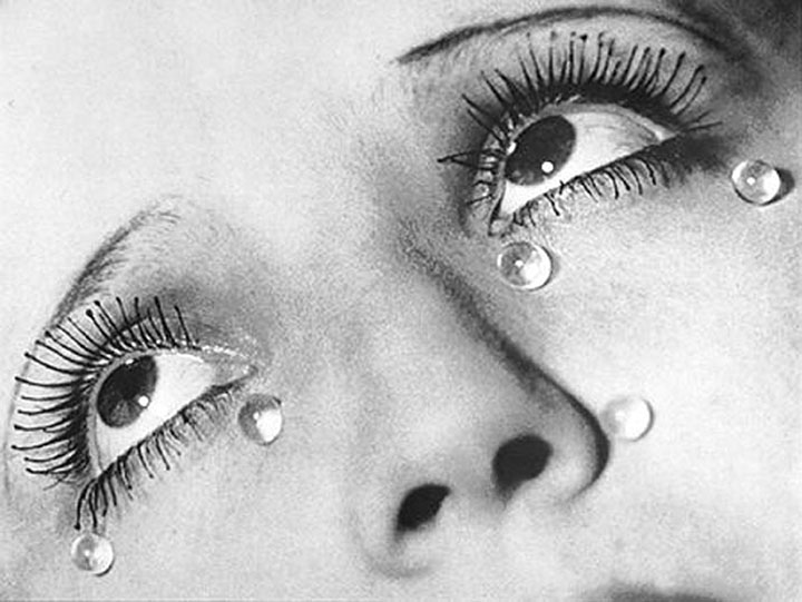
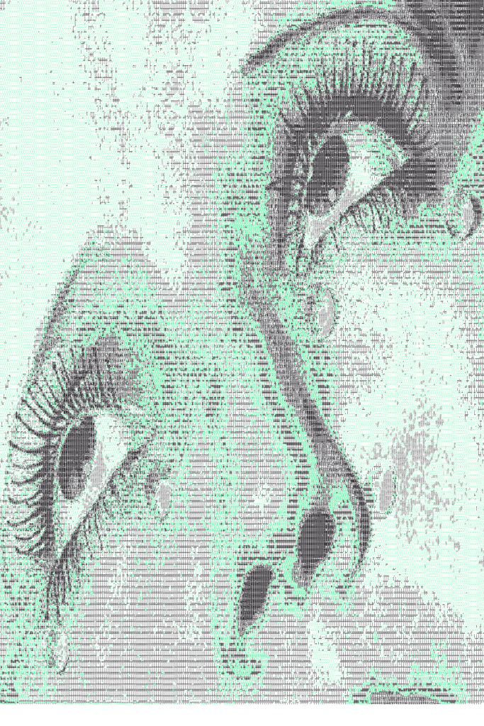
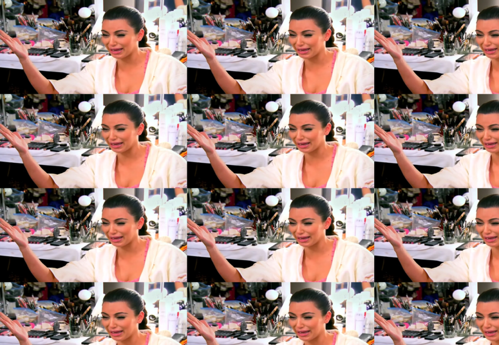
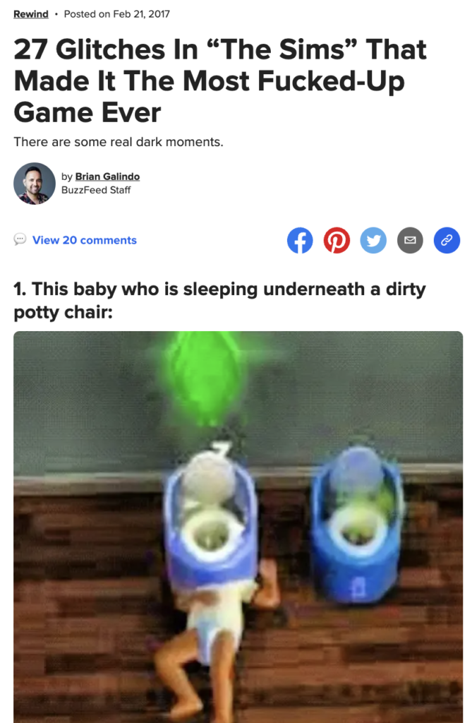
The images that were selected for this zine were largely split into two categories, including some photos of recognizable figures or moments from popular culture that display such ‘private’ behaviors and images of ‘sims fails’ where characters fail to function normally or as expected. As a gesture of appropriating and unifying the various aesthetics of the collection of images we employed methods of generative design referenced from ‘Generative Gestaltung’ in some ways to maximize the chaotic and random nature of the message of our project. Also such image treatment helped with augmenting the organic quality that risograph prints tend to produce.
Layout Inspiration
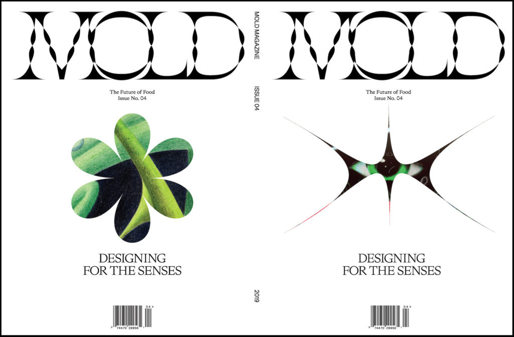
Our layout choices were very much made with the intention to emphasize the focus on the images that we selected- employing minimal typography and the use of negative space to create space for the viewer to digest the amount of visual information that is presented in the zine. It felt that the layout was pivotal in creating a more cohesive output for our zine as we had a large range of image treatments but also decided to embrace the somewhat chaotic nature of the zine that came as a result as well.
Printing Process
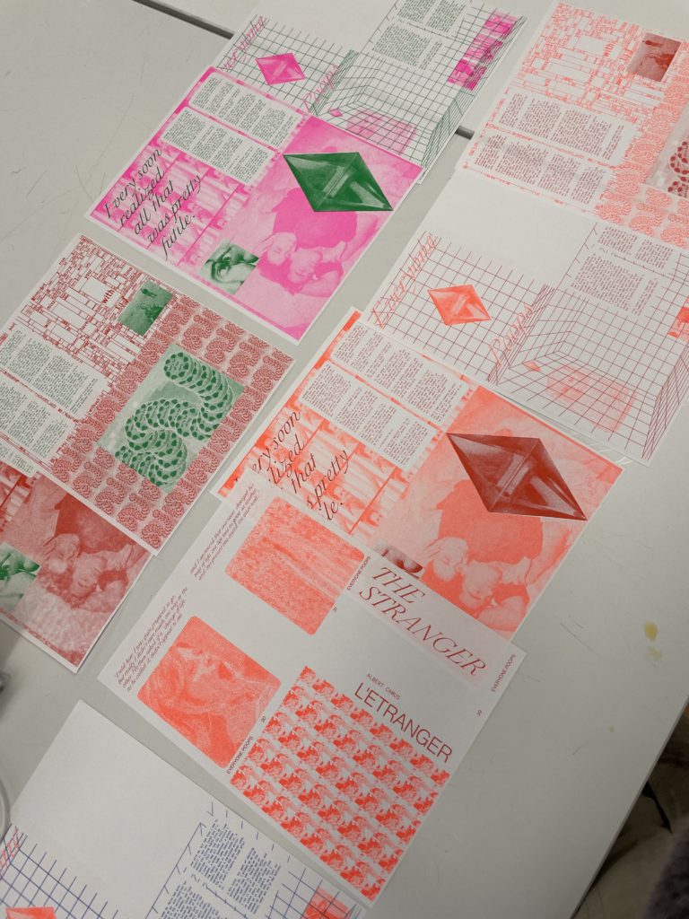
We first tested out printing a couple of spreads with two colors. No matter the combination, this version was a bit too uncanny and unsettling for our visual aesthetic.
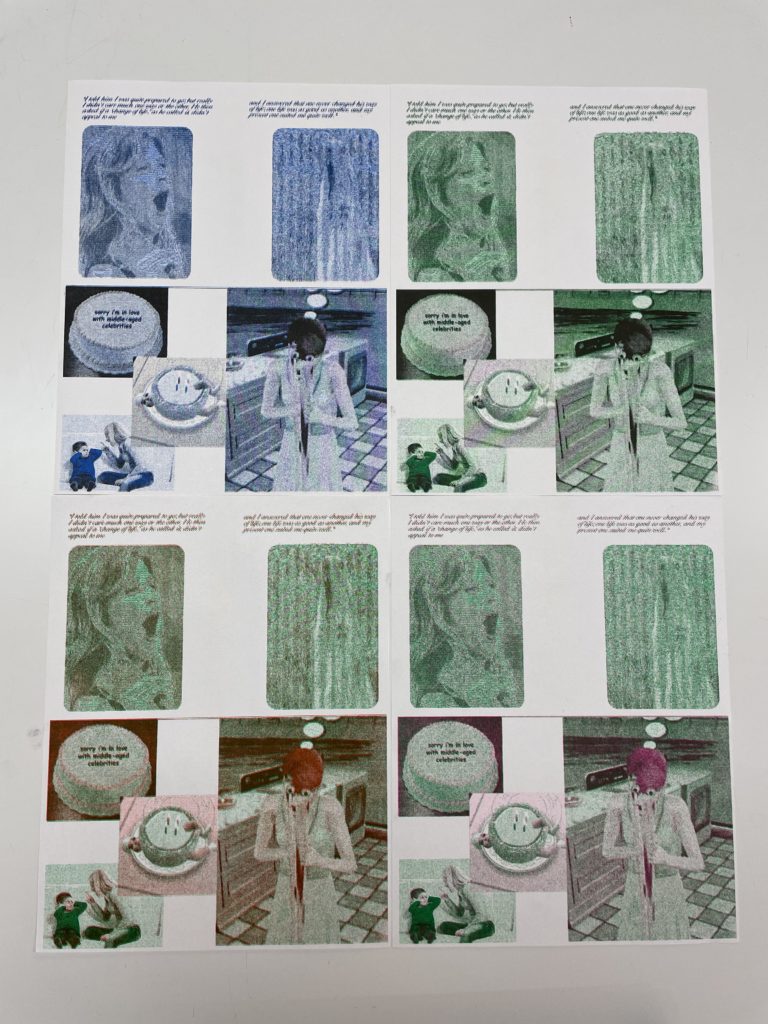
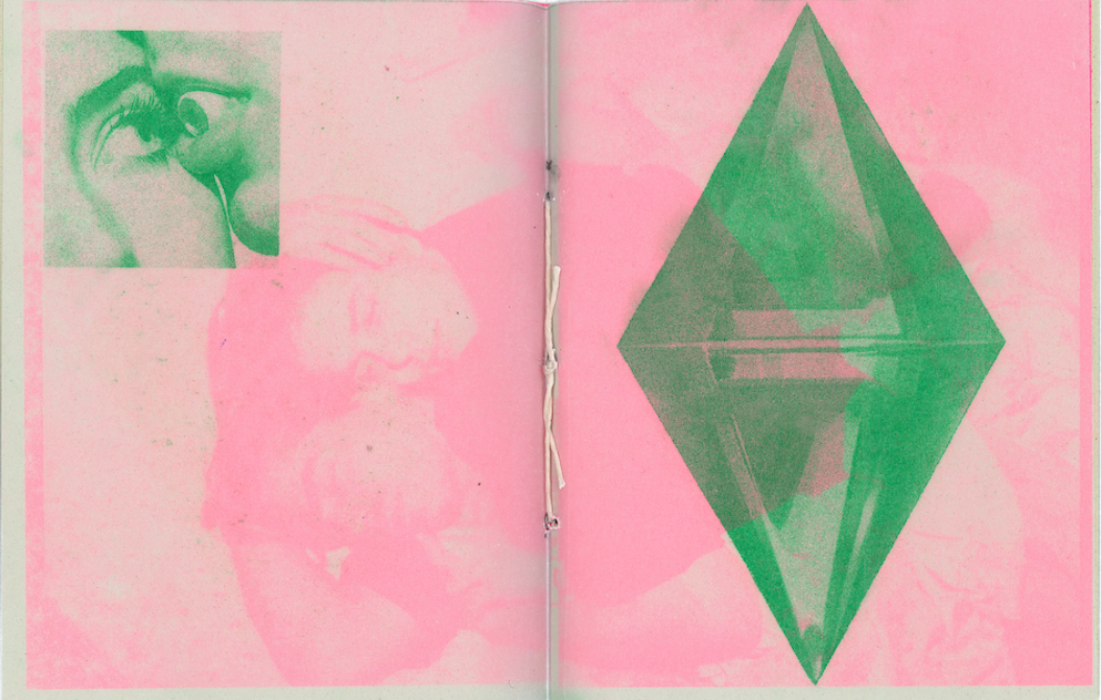
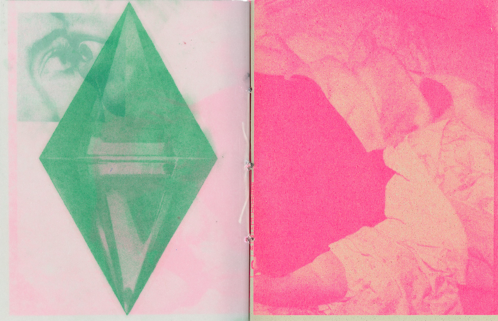
We then decided to separate the spreads into two colors that don’t overlap. Originally we wanted to print with blue and orange, however, after the first print pictured below, the print lab ran out of blue ink (*cries*). After testing a few more variations, we landed on green and fluorescent pink for our color combination.
Final Result
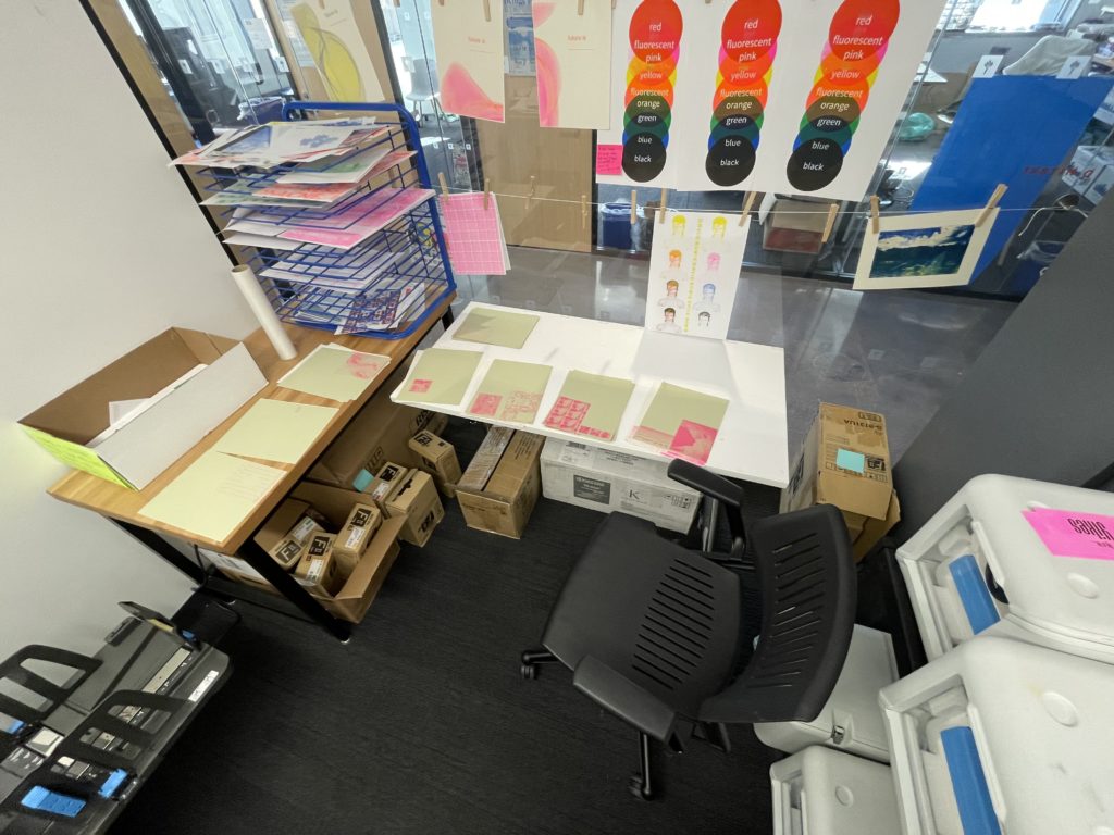
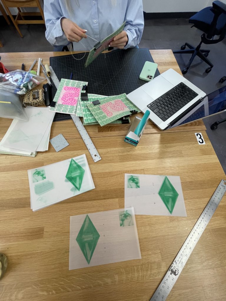
The final zines were printed on “crush kiwi” green and cream-white. We printed some sheets on transparent paper for a multi-dimensional visual effect. Overall we really enjoyed the process of this assignment.
