Intro
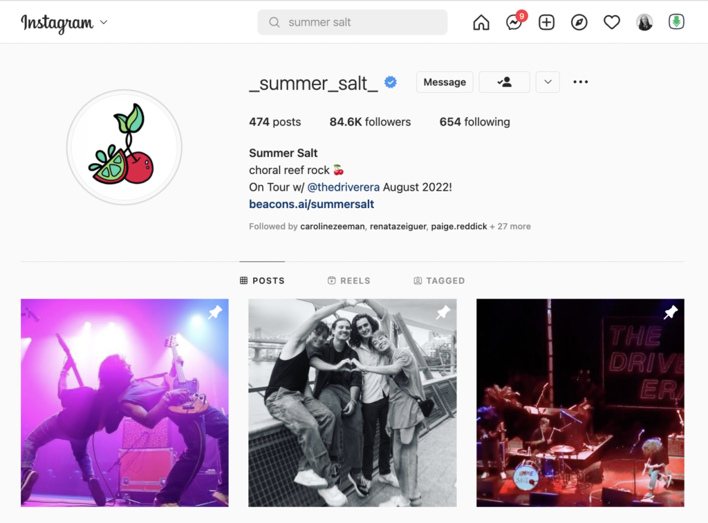
Inspiration: I wanted to create a practical use for my Riso animation so after our first class and hearing the brief I reached out to a few artists over IG to see if anyone needed new album/single art and proposed my idea to create one using the Risograph machine. For this, I used both the work of Julia Schimautz and a friend from ITP, Julia Fernadez’ work (see example below). This is the hand drawn style I wanted my Gif to have a similar feel too.
Process
Planning: Once an artist got back to me I began coming up with concepts for the piece. The band who responded, Summer Salt, has 4 members, and I liked the idea of incorporating all 4 of the members on the cover in different quadrants. They don’t live in the same cities, so the next step was a Facetime call with each member and capturing their facial expressions that I could then use as a reference point for the animation.
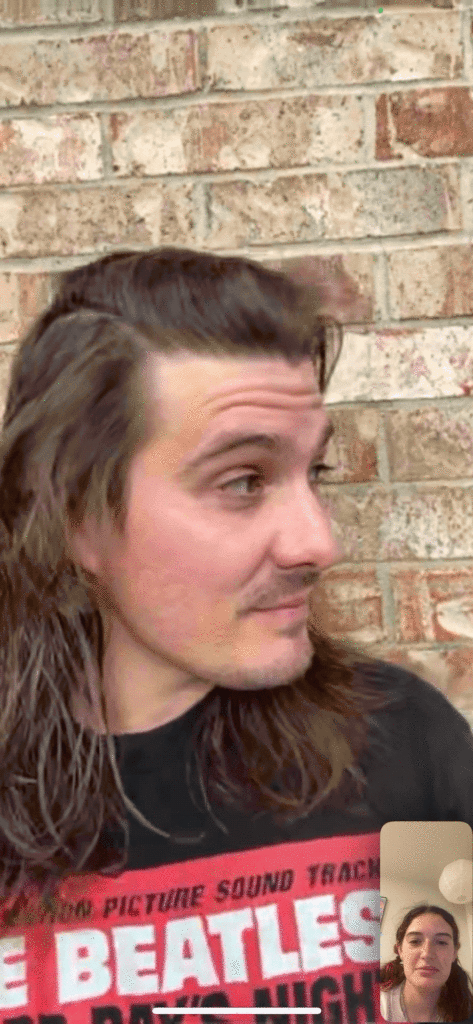
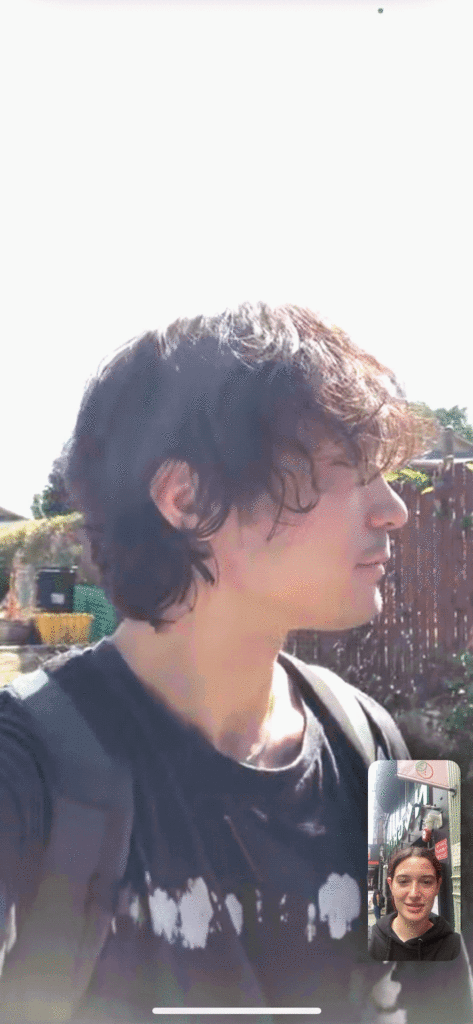
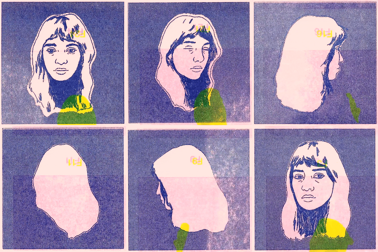
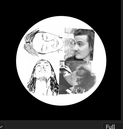
Compositing: I was fortunate enough to borrow a friends iPad for the day for the project in which I used Procreate to create 4 individual sketches that were 20 frames each. I wouldn’t consider myself an illustrator and this stage took a significant amount of time to draw each frame. Once these were complete I exported them into Premiere and began rotating the 4 heads around to create a composition I was happy with.
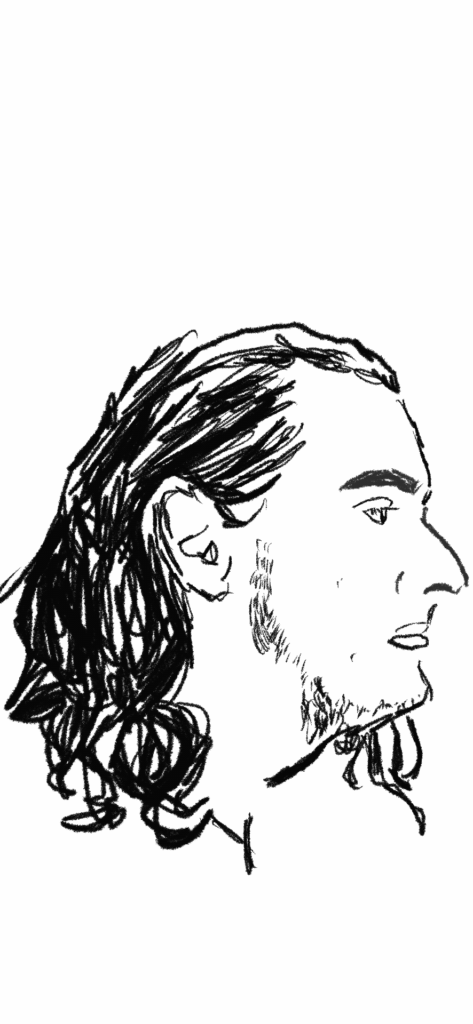
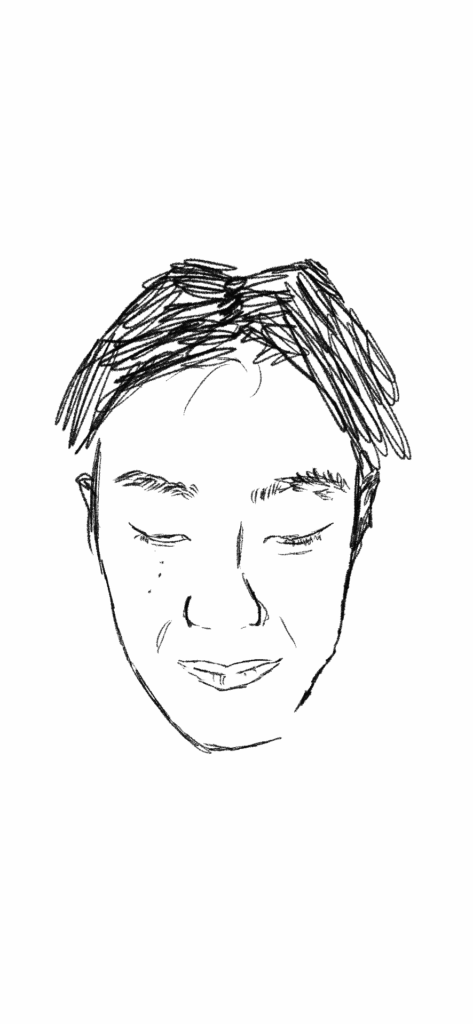
Color Scheme: Using the book that Kelli provided us in class I created multiple different options for a color scheme, also keeping in mind my personal style and the band’s image. At this stage I really struggled and couldn’t create a 2 color option I was satisfied with, so attempted a few designs with a 3 color scheme.
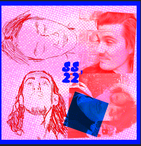
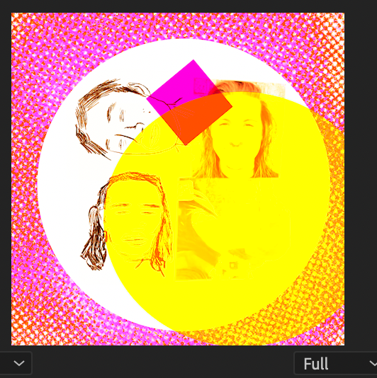
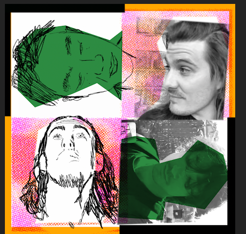
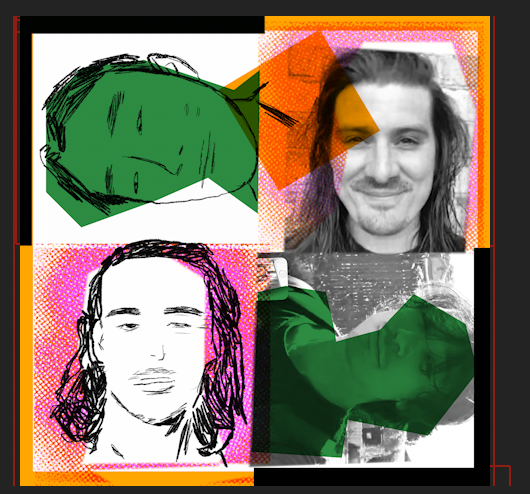
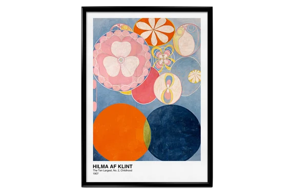
Inspiration #2: Realising how much time I was spending on color combinations I tried to use a piece of work I already liked and draw inspiration from its scheme. I have this poster (see below) hanging above our couch and decided to draw from these colors for my Gif. I also ended up using similar elements such as the flowers in my final composition. I also added a halftone texture to the background that rotated with each frame (inspired by Julia Schimautz’s piece Rotating Halftones).
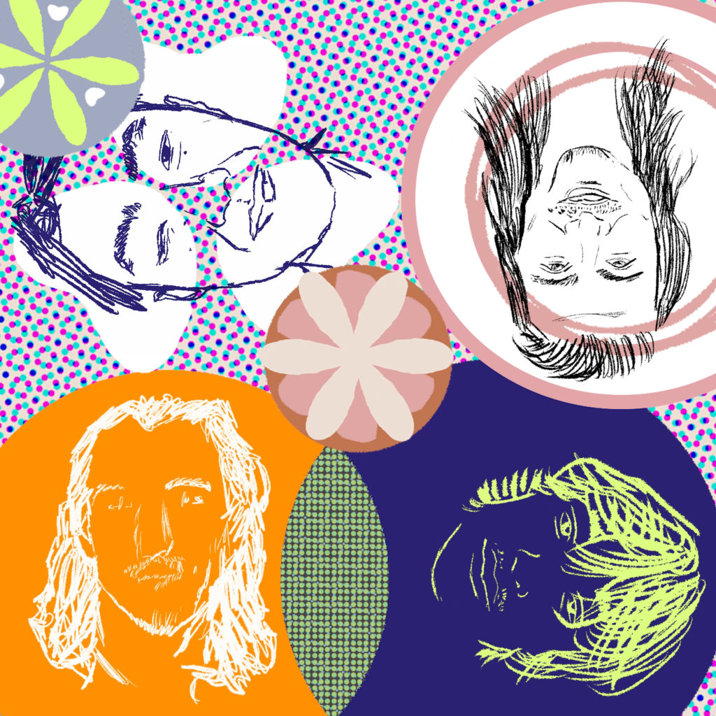
Getting the Print Press Ready: I exported the Premiere file into a GIF in Photoshop and separated out the 4 channels into CMYK. Using the Color Book Kelli had brought in a found colors that were the closest to this. For my print, the closest I thought I could get to my on screen look would be to use Blue for C, Fluro Pink for M and Yellow for Y. I then uploaded the individual channels into a P5 sketch (see link below) to get a better understanding of how the final print might look.
https://editor.p5js.org/edenmili/sketches/ZTIUdlz2kPrint Time: With Yixun’s assistance I printed the 3 layers. In this stage, we experienced difficulties lining up even 2 of the layers, let alone 3. The overall effect looked messy and unpolished. I had an idea that instead of printing them on top of each other we could print out the C, M & Y layers individually, and then I would merge these using the Multiply function in Photoshop in Post.
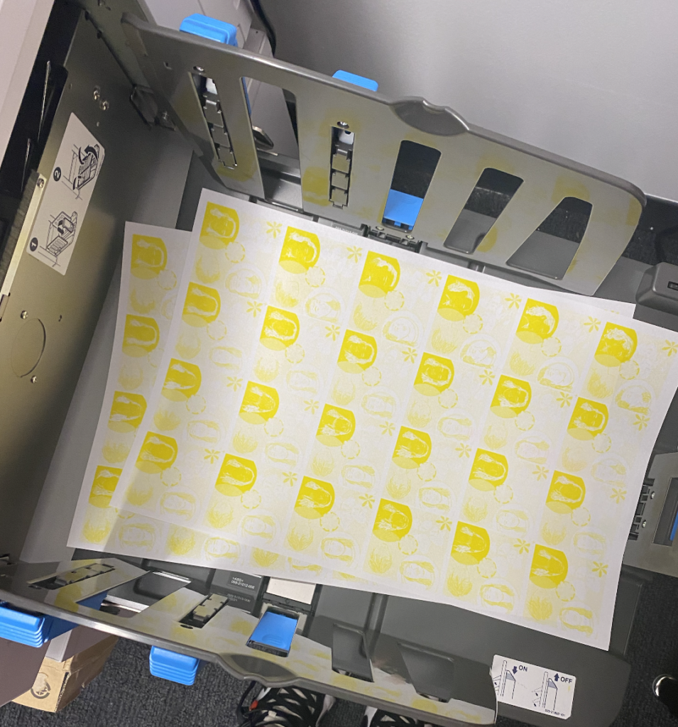
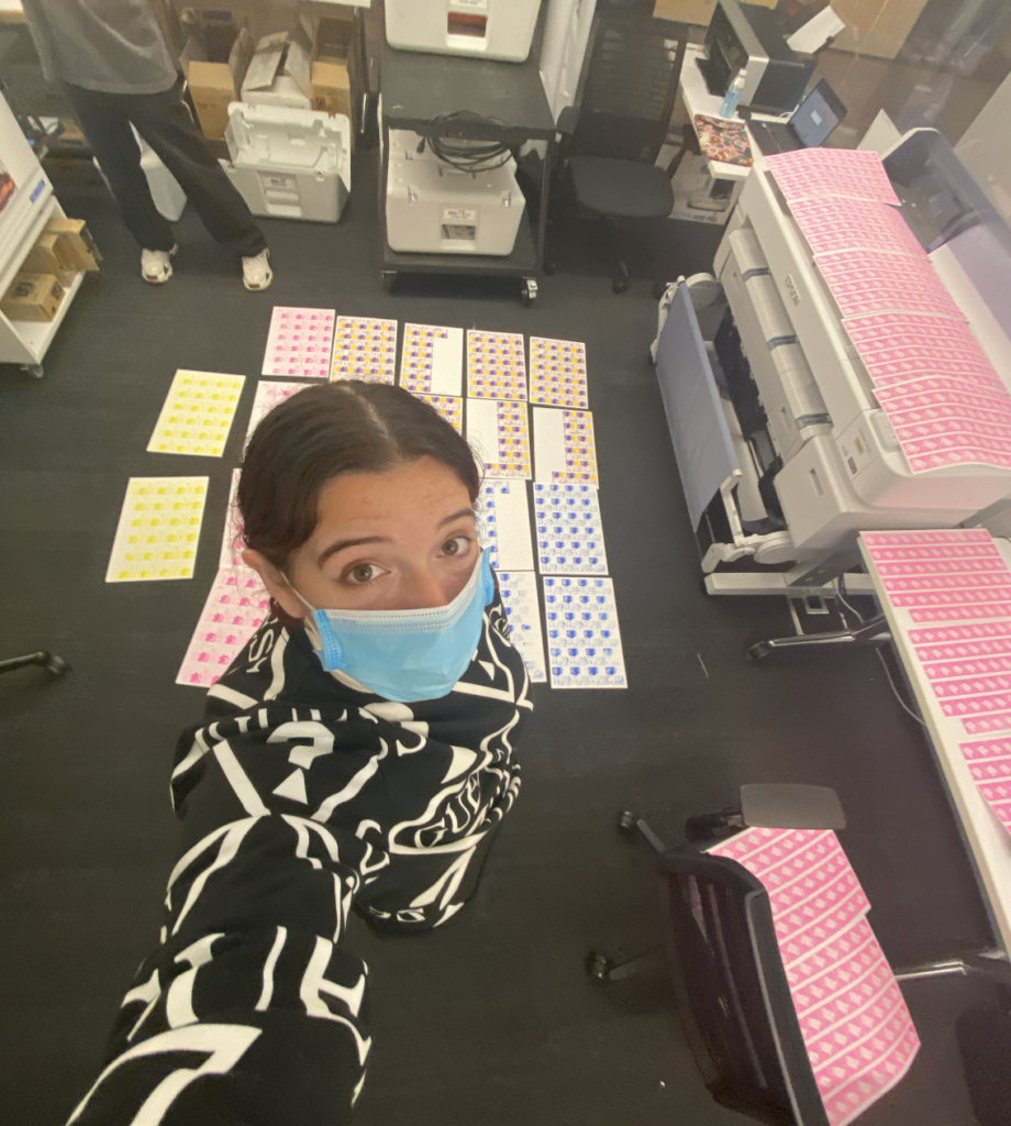
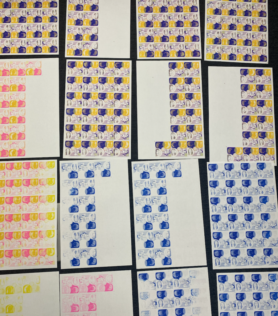
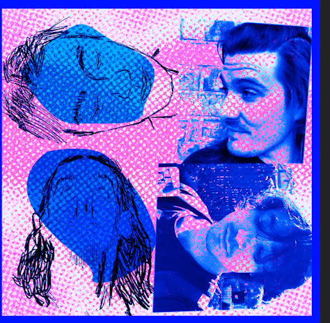
Post: Trying to recreate the original Gif colors in the final piece was proving to be more difficult than expected, so I had to let these go and still produce something while still maintaining the Hilma AF Klimt look I wanted. After playing around in Photoshop and Premiere – this was the final result:
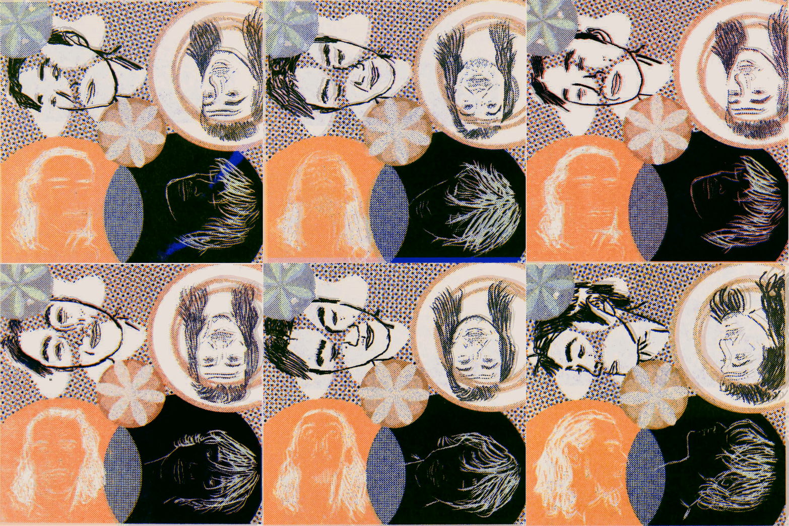
New cover will be out shortly on @summer_salt
