(by Mikayla Rogers)
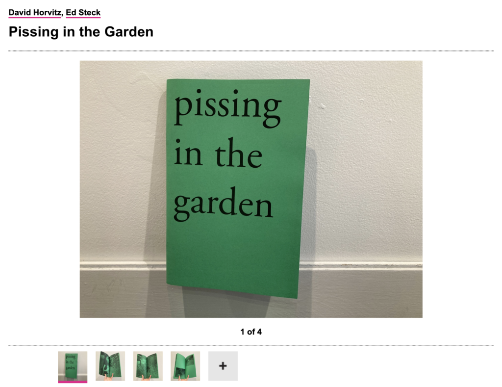
This 80-page zine depicts about 50 of the publisher’s friends peeing in his garden. His goal was to document a network—of friendship, landscape, and nature—through “the intersection, the blurring, the intertwining and connection that happens in this between each person and the soil and plants.” I love that the premise of the zine’s documentation is visually simple, yet holds a much deeper-rooted meaning. Pissing in the Garden was laser printed on green colored paper, which I think was a successful color choice, bringing the theme of the natural altogether.
2. Ábécés könyv (Alphabet Book)
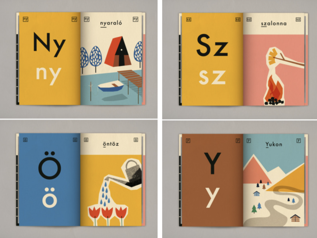
Anna Kovecses’ intent was to illustrate a Hungarian alphabet book for her 4-year-old daughter. Each letter of the alphabet is paired with an illustration. “The illustrations were chosen carefully to show what she was interested about at that time, making this book a diary of her life and little segments of her character.” The design style is really lovely, and if you look closely you’ll notice that all of the illustrations were made with simple shapes put together. The color palette also plays a big role in making each page eye catching. I love that this book was created personally, by a mother designing it around and for her daughter. Anna’s documentation doesn’t give details about the book’s printing process.
3. Brick Wall
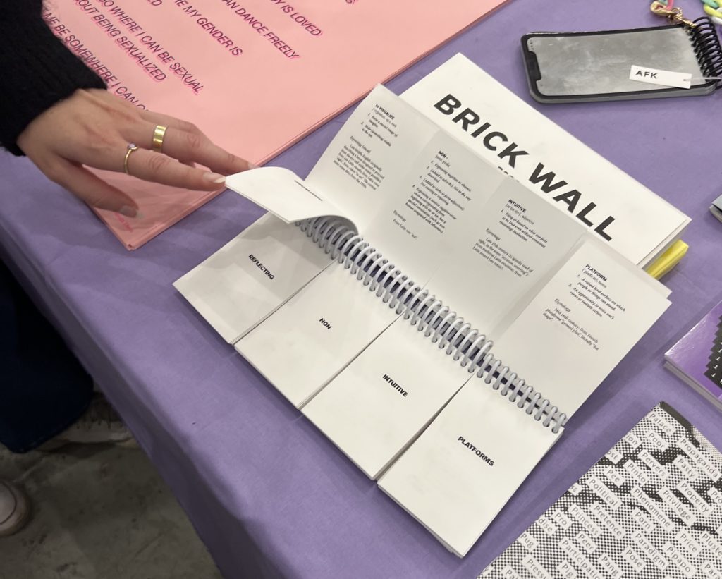
Unfortunately I did not get a chance to jot down the artist or studio this zine was from at the Book Fair, thus I’m also not exactly sure of how it was printed. However, I’m completely taken by the mastery of this zine’s form. I believe this zine’s goal is to be a source for inspiration of words when you’ve hit a brick wall, and when you flip through the pages the backs of each give the definitions. I’m sure there’s a deeper relationship between the words that unfortunately I did not catch, but I love that the type and colors are simple, yet the experimental flipping nature adds so much to its effect.