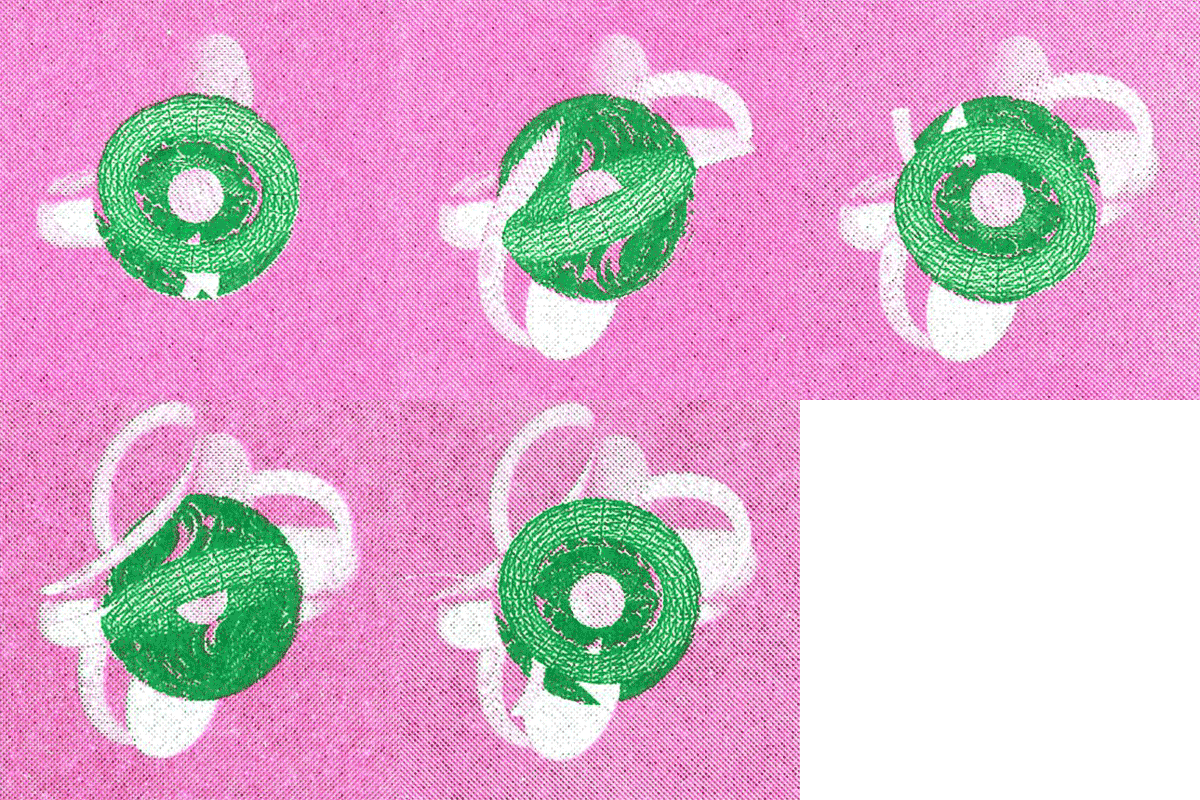
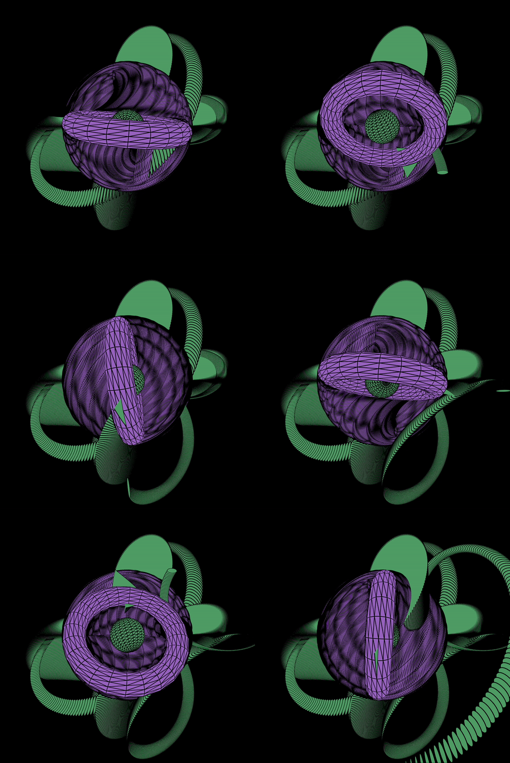
For my riso animation I created a interaction between three dimensional shapes rotating and intertwining with each other on p5.js. I wanted to test how such three dimensional shapes and movement could be captured and transformed when printed in riso.
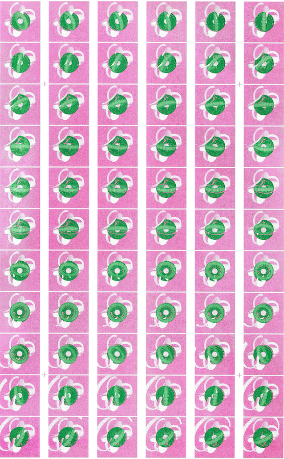
I tried different color combinations and paper options- the first iteration was created in neon pink with an overlay of green on top for emphasis of the rotating torus. I found that with the green on top of the pink it seemed a bit strong and actually preferred the version before the two colors were layers. As an after thought I think that this could have probably been a problem with color separation and tweaking in photoshop.
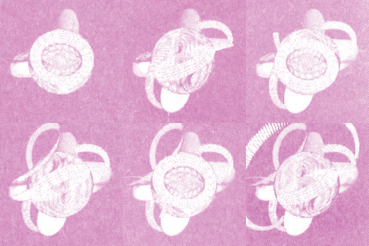
The second iteration of the animation was created just with a layer of neon pink on white paper which seemed to offer a different perspective and was better at showing the movement of the shapes but lacked a bit of contrast.
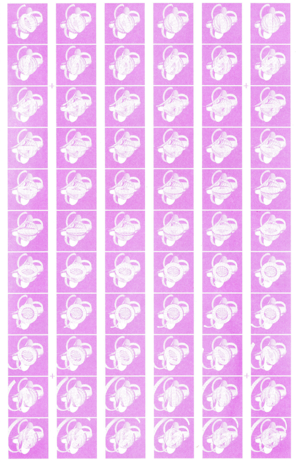
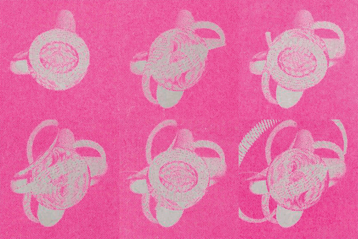
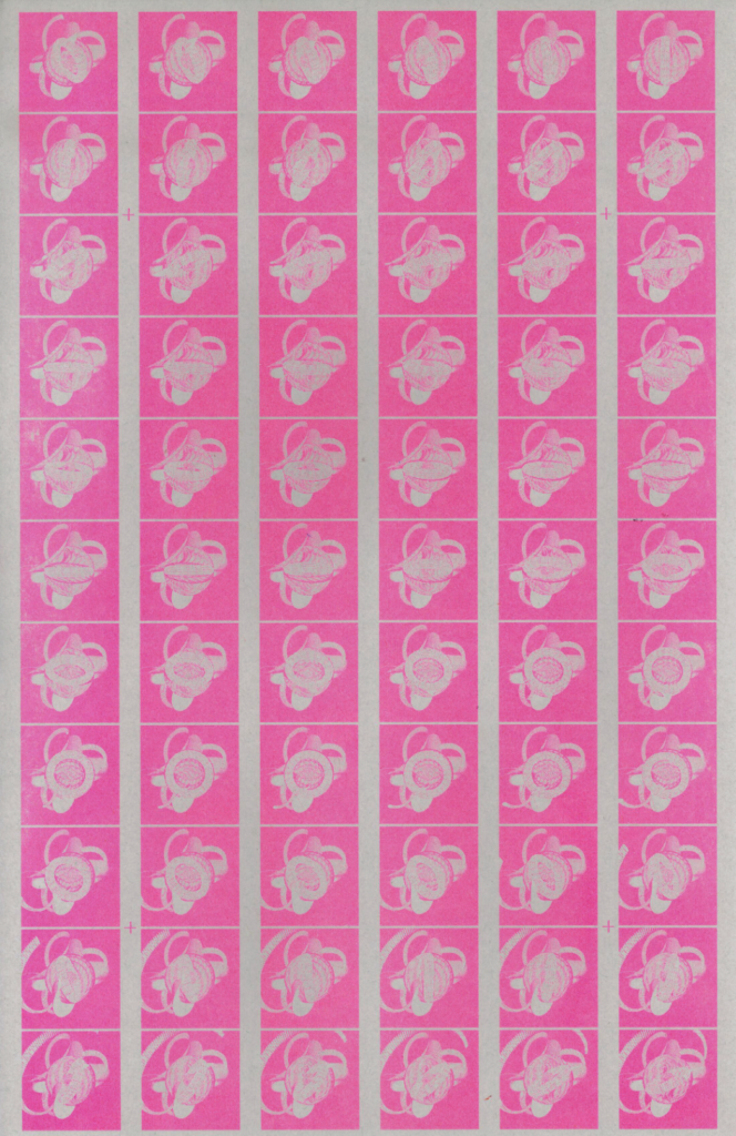
The last iteration was the same neon pink layer printed on light grey paper which I really enjoyed because the color combination seemed to strengthen the contrast. Although I do think that the resolution of the animation was also a contributing factor to the low contrast and could be revised by sizing up the images on the contact sheet and maybe deleting some of the frames.
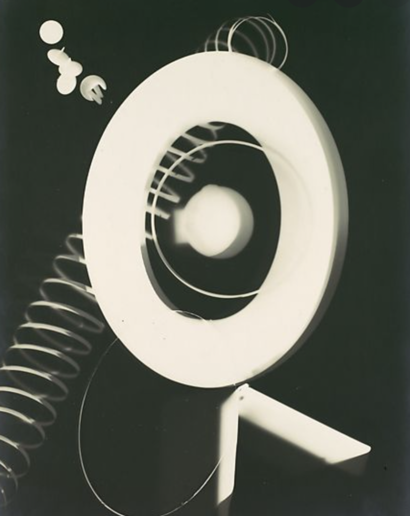
Lastly, this rayograph by Man Ray was the initial inspiration for the assignment- the image itself shows opacity and objects that are seemingly floating in motion and I thought it would be interesting to re-interpret them actually in motion. In addition, I thought that recreating this rayograph with dynamic movement and printing it on the riso printer would create an interesting paradoxical effect.