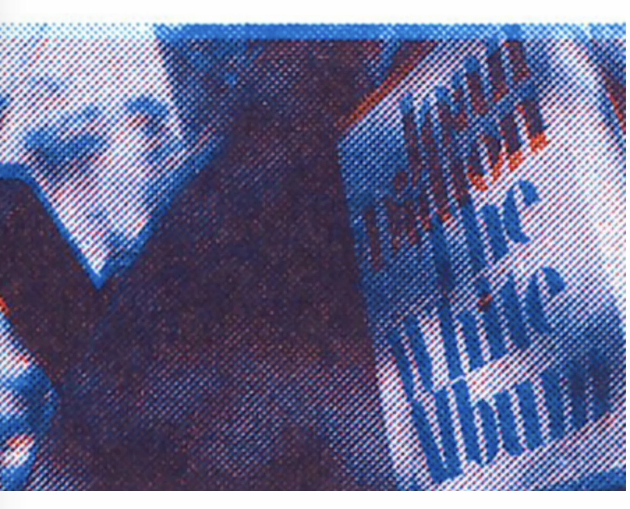
Above is the original video that was eventually turned into a risograph animation. It was filmed when I was sitting outside, reading the book called the While Album by Joan Didion. I was trying to capture the dancing light and shadow from the afternoon sun and the leaves swinging behind me. They landed right there on my book. The white paper vividly showcased the movements of their dance. They were also accompanied some light winds that were swaying by and turning pages of the book. The dancing shadow started jumping and escaping through pages and finally arrived at the beautiful front cover. It was like watching an animation collaborated by nature and this book.
I picked this video because I am very curious how the relationship of light and shadow will be presented in risograph. Here is the result:
Reflection
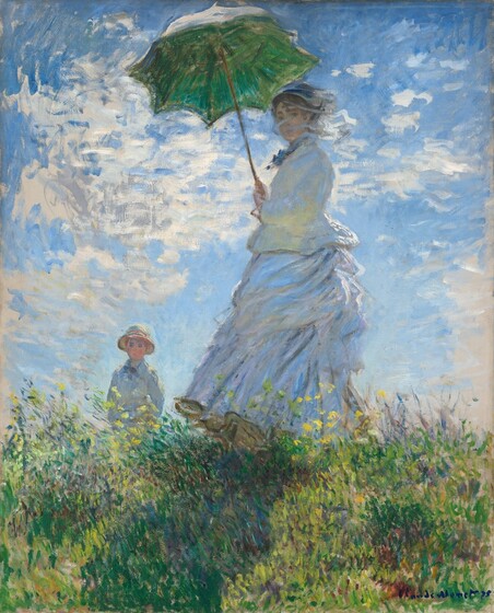
I really like the visual effect resulted from the riso grains. It tunes down the clarity of a high resolution video and somehow makes the scene feel more lively, like you could better see the time was moving, things were changing. I believe this is a similar kind of effect and feeling I get from staring at impressionist paintings like this one:

I also really like how the relationship of light and shadow is portrayed through the movement of clusters of riso grains. They formed organic shapes like breathing cells or clouds that merges together or dissolves away.
For the future project, I would love to continue experiment with light and shadow captured IRL but I would be more mindful on the movement pattern and also the background settings. I want to brainstorm about what other patterns and scenes I could film. I think paying more attention to my the general color tone of the video could also bring more color variations to the final result. The current one, to my surprise, turns out to be more like monotone except the final frames of the book cover —

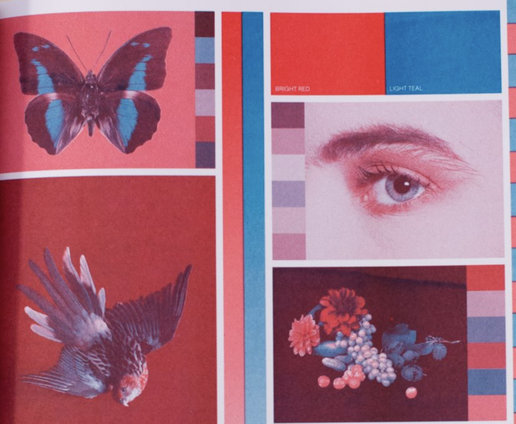
What I expected:

So question: What should I do in order to get this range of color dynamics?
I also noticed the less frames on one paper, the easier to align them together for printing different colors on top of one another and also for stitching back the frames of the animation. I will definitely keep this in mind in the future.