呼氣 吸氣 (breathe out, tune in) is an exploration of movement and experimental typography, and pays homage to the moody feeling I associate with California. The background video is my friend sticking her hand out of the car window on the way home from watching a sunset in Oakland. The text is generated with WebGL in p5 – I used rotation and sin() to generate the twisting effect. Unfortunately I didn’t save the version of the code I ended up using before changing the parameters, but you can see a similar iteration here. I then overlaid a screen recording of the p5 sketch onto the background video in premiere and exported it as a gif.
To prepare the gif for print, I exported the gif layers as files in photoshop and then used the function to generate contact sheets. This step caused me a lot of issues in Kelli’s workshop, as the contact sheets would render blank and I couldn’t figure out why. I ended up realizing the contact sheet would only render if the source files were .psd, rather than .jpg.
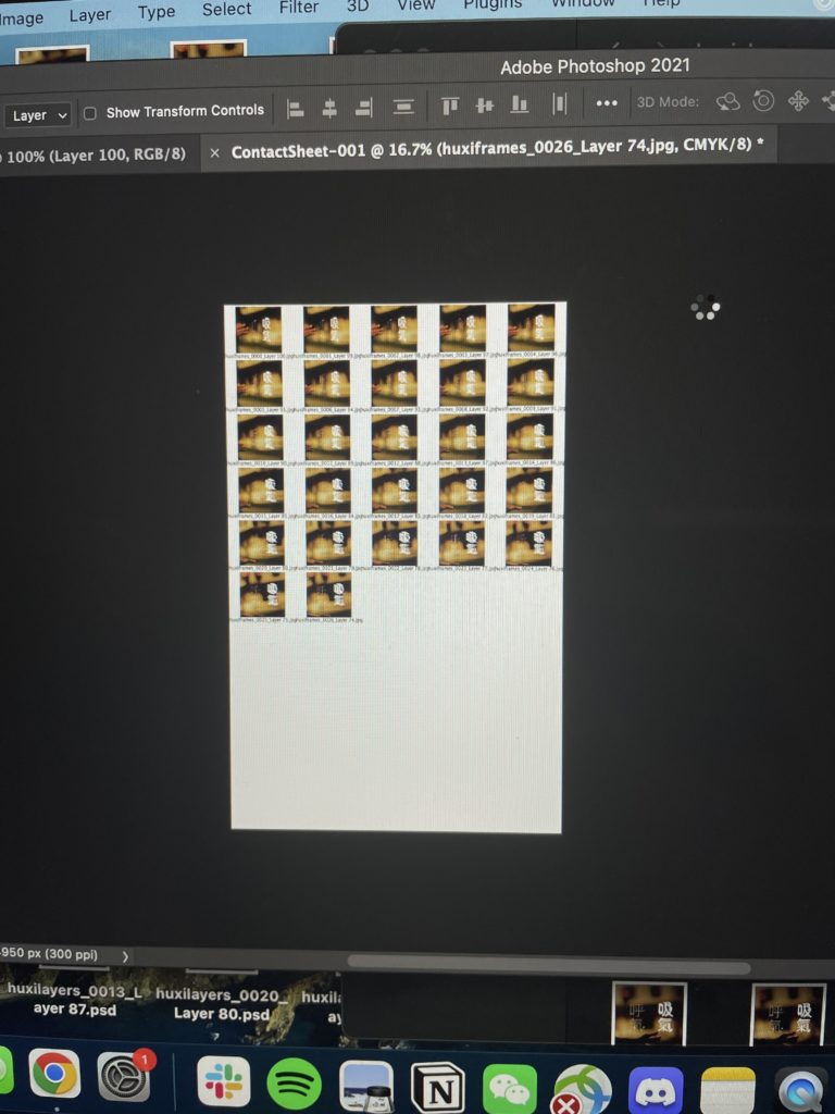
After the contact sheets were ready, I then prepared the sheets for the two-color print. Since my source footage is has lots of yellow and black, I wanted to keep the contrast up – so my final files were 1) cyan and black channels layered on top of each other, which was printed as black, and 2) the yellow channel, which was printed as pink.
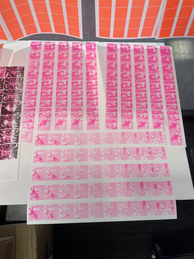
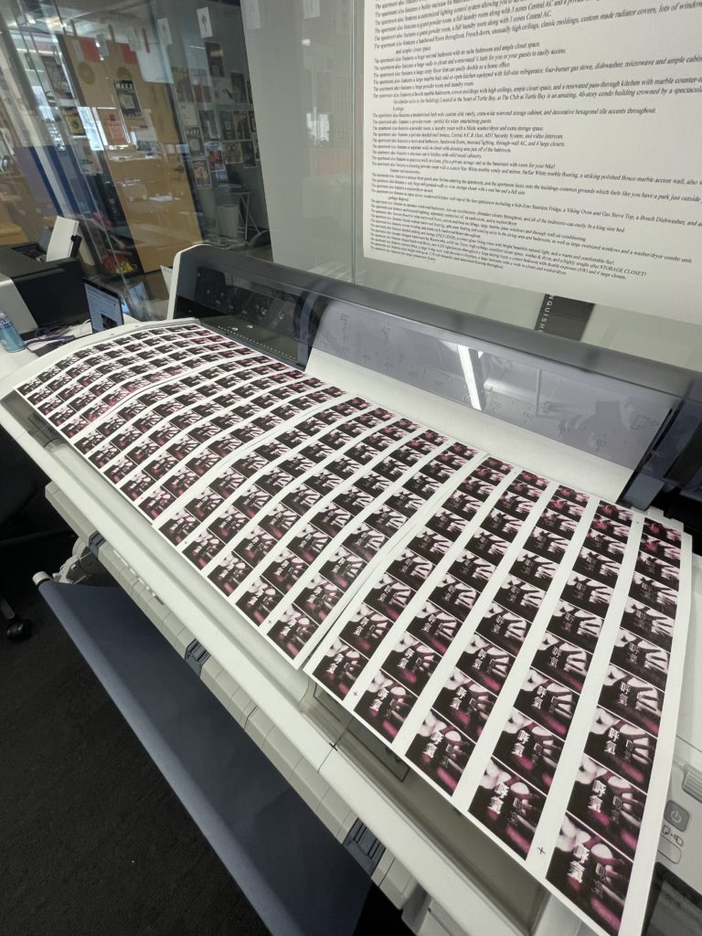
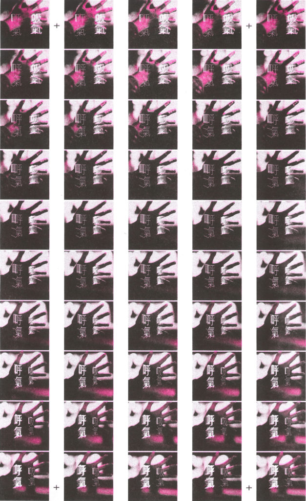
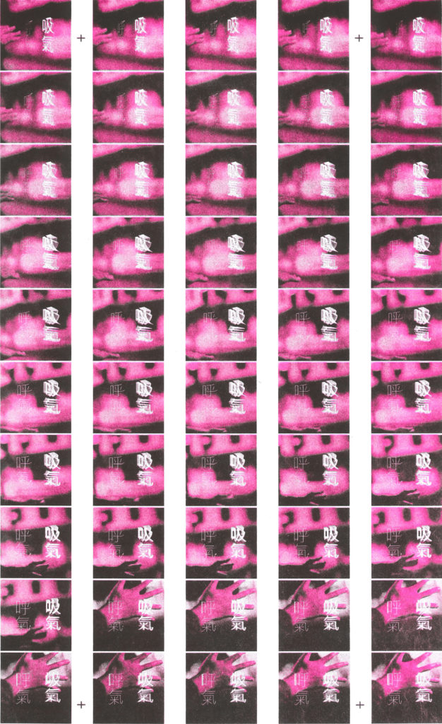
contact sheets
The final result was made using the in-class animation code in p5.
Key Takeaways:
- I generated the WebGL text in the p5 web editor, which in retrospect was a mistake, as I was constrained to font families that were smaller than 5MB. If I could re-do this assignment, I would work in a text editor so I could use a font that was a bit bolder, as the thinness of this font makes the color bleeding rather noticeable.
- I really like the result of the pink and black color combination. I was really worried that I would have major alignment issues. While there are some parts where there is a clear separation between the two layers, I am pleasantly surprised with how the text turned out.
- Too much contrast? I increased the contrast in my initial animation before printing, and then only picked the yellow channel to output in the pink layer. This leads me to want to learn more about color balances/curves in photoshop, as even though I like the outcome, I think there is room for improvement in how I set up the layers.
- Due to the time constraints of this course, my final output is a screen recording of the p5 animation. In the future, I would really like to explore the other code-based animation methods in order to produce the highest quality video file.