Josh starts off by citing his inspiration from W.E.B DuBois, how his data visualization treated the “facts he obtained with the delicacy of an artist,” and how the data DuBois visualized was “remarkably creative in both form and content.” He talks about one of his first projects, which detailed the race questions of every U.S. census, and showed how racial catigories changed over time. He talks about a project he worked on that visualized prisons across America, by cycling through data points in Google Maps datapoints. This allowed him to effectively visualize incarceration in America, rather than an overhead map that is oversaturated with prisons, which made it difficult to truly grasp the magnitude of the situation. He also has made an app that alerts you when someone overseas is hit by a U.S. drone strike. There was a lot of controversy about this, and Apple kept rejecting it. I think it’s important to have access to this so we aren’t so ignorant when it comes to foreign affairs, to have a little more of a glimpse into the lives of people in the Middle East that our country affects so greatly.

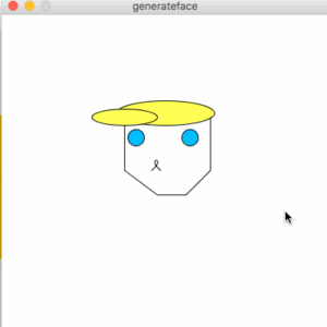
 I made it into a picasso type face, and added moving eyebrows, and restructured the face using beginShape.
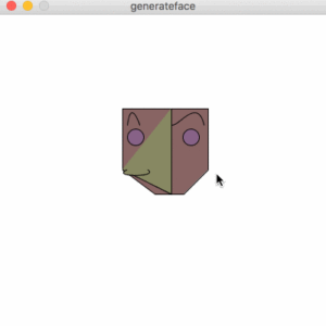